

You’ve designed the perfect party favors. You’ve printed them on beautiful, vibrant paper, and assembled them with care. They look absolutely incredible sitting on your craft table. But when you pull out your phone to snap a picture, the result is… disappointing. The colors look dull, there’s a weird glare on the glossy finish, and the background is distracting.
Sound familiar? As creators who have photographed hundreds of our own printable party favors for our shop, social media, and blog, we’ve been there. That frustration is exactly why we mastered the art of DIY product photography, and we’re here to show you how to do it, too. Forget expensive cameras and complicated studio setups. We’re going to teach you how to get that bright, crisp, “Etsy-ready” look using your smartphone and a little bit of creative know-how.
This comprehensive guide will walk you through everything from setting up a simple home studio to styling and shooting specific types of favors, editing your photos like a pro, and optimizing them for every platform. Let’s turn your beautiful creations into photos that truly do them justice.
Why High-Quality Party Favor Photography Matters
Product photography for party favors isn’t just about taking a picture; it’s about telling a story and showcasing the value of your hard work. Whether you’re capturing memories for a family album or building a creative business, great photos are your most powerful tool.
- It Builds Trust and Credibility: Crisp, well-lit photos make your DIY skills look professional and reliable. For entrepreneurs, this is non-negotiable. It shows customers that you care about quality, which builds the trust needed to make a sale.
- It Drives Engagement: On platforms like Pinterest and Instagram, stunning visuals are what stop the scroll. Bright, clear photos of your favors are far more likely to be shared, saved, and loved, growing your audience and reach.
- It Creates a Professional Portfolio: Each photo you take serves as a piece in your digital portfolio. It documents your creative journey, showcases your skills, and can help you land party planning gigs or sell more products; for inspiration on professional event setups, check out WOW Occasions.
- It Preserves the Details: Let’s be honest—most party favors get eaten or tossed. A beautiful photograph immortalizes the love and detail you poured into creating them, preserving the memory long after the party ends.
Common Photography Mistakes to Avoid
Before we dive into the “how-to,” let’s identify the common pitfalls that can sabotage your photos. Recognizing these is the first step to fixing them.
- The “Dark Room” Trap: Relying on the yellow, overhead lights in your kitchen is the fastest way to get dull, color-inaccurate photos. Artificial indoor lighting casts harsh shadows and distorts the true colors of your designs.
–Cluttered Backgrounds: A messy countertop, a random pile of mail, or a distracting rug pattern in the background pulls focus away from your beautiful favor. The background should complement your product, not compete with it.
–Blurry or Unfocused Shots: A slightly shaky hand can result in a blurry photo that makes your work look amateur. Focus and stability are key, even when using a smartphone.
–Harsh Glare on Glossy Paper: Using your phone’s built-in flash or direct, harsh sunlight will create a blinding glare on glossy finishes, completely obscuring your design. This is one of the biggest challenges in photographing printable party favors, and we have the solution.
Setting Up Your DIY Home Photo Studio (It’s Easier Than You Think!)
A “home studio” sounds intimidating, but it’s really just a designated spot with good light and a simple background. You don’t need a dedicated room; a small corner near a window is perfect. Here at Hanging with the Kiddos, our entire photo setup is portable and costs less than $20.
Mastering Light: Your Most Important Tool
Great lighting is the secret to professional-looking photos. The best light is natural, indirect, and free! Forget fancy lighting kits; all you need is a window.
Find Your Indirect Light Source: You’re looking for bright, soft light, not direct, harsh sunbeams. A window that doesn’t have the sun shining straight through it is ideal. This could be any window in your home depending on the time of day. An overcast day is actually a photographer’s best friend because the clouds act as a giant, natural diffuser, creating perfectly soft and even light.
How to Control Glare on Glossy Paper: That beautiful sheen on our Premium Glossy Paper makes colors pop, but it can be tricky to photograph. Here’s the secret: position your setup so the light from the window hits your favor from the side (at a 45-degree angle), not head-on. This technique, called side-lighting, illuminates the product without creating a direct reflection back into your camera lens.
Use a Reflector to Banish Shadows: Notice how one side of your favor is bright and the other is a bit shadowy? Let’s fix that. Grab a simple piece of white foam board (from any craft or dollar store) or even a clean sheet of white printer paper. Hold it opposite your window to bounce the light back onto the shadowy side of your favor. This simple trick instantly brightens your entire product and gives it a professional, high-end look.
Pro Tip: Never, ever use your camera’s built-in flash. It creates harsh, unflattering light, deep shadows, and that dreaded glare on glossy surfaces.
Essential Tools for a Professional Look
- Backdrops: Keep it simple. A clean, neutral background ensures your party favor is the star. We use a standard white foam board or a piece of poster board from the dollar store. You can also find vinyl backdrops with realistic marble, wood, or solid color textures online.
- Stability: A small, inexpensive smartphone tripod is a game-changer for getting sharp, clear photos. If you don’t have one, no problem! Prop your phone up against a stack of books or a coffee mug to keep it steady.
- Smartphone Settings: Before you shoot, take a moment to prep your phone. Wipe your camera lens with a soft cloth. Turn on the grid lines in your camera settings to help with composition (we’ll get to that!). If you have it, Portrait Mode can be great for creating a soft, blurred background on “hero shots.”
A Guide to Photographing Specific Party Favors
After photographing countless designs, we’ve learned that different favors require different approaches. Here are our go-to styling tips and camera angles for the most popular printable party favors.
How to Photograph Chip Bags
- Best Angle: The Flat Lay (a top-down shot). This is the classic, go-to shot for chip bags as it displays the full design beautifully.
–Pro Styling Tip: Don’t photograph an empty, flat bag! To give it a realistic, filled shape, stuff it with tissue paper, poly-fil, or even cotton balls. This makes it look substantial and professional. For a great shot combination, style one perfectly stuffed bag next to an unassembled, flat version to show customers exactly what they’re getting.
–Common Mistake: Overstuffing. You want a gentle, natural shape, not a bag that looks like it’s about to burst.
How to Photograph Mini Cereal Boxes & Treat Boxes
- Best Angles: The “Hero Shot” (eye-level) and the 45-Degree Angle. These 3D items need to show off their depth and structure.
–Pro Styling Tip: Use props to tell a story and show scale. For a cereal box, scatter a few pieces of the actual cereal around it. For a treat box, have a colorful ribbon or a few candies spilling out. This makes the scene feel dynamic and alive.
–Common Mistake: Shooting from too high above. A top-down shot will flatten the box and hide its 3D shape.
How to Photograph Candy Bar Wrappers
- Best Angle: The 45-Degree Angle. This is the most flattering view, showing the front design while also hinting at the wrapped sides.
–Pro Styling Tip: Always wrap the design around an actual candy bar for your photos. It gives the product context and a realistic shape. Style it with a few unwrapped pieces of the same candy for color and texture.
–Common Mistake: Wrinkles and messy folds. Take your time to wrap the candy bar neatly with crisp edges for a polished look.
How to Photograph Water Bottle & Capri Sun Labels
- Best Angles: A straight-on shot or a slight 45-degree angle. For online listings, also include a flat lay of just the label.
–Pro Styling Tip: Make sure the bottle or pouch is clean and free of smudges. For water bottles, a few “beads” of condensation can add a refreshing look (a light spritz from a spray bottle works perfectly). For glossy sticker paper like our popular option for juice and water labels, be extra mindful of side-lighting to control reflections.
–Common Mistake: Leaving the original brand label on underneath. This can sometimes show through your custom label, creating a lumpy or discolored appearance.
Step-by-Step Editing to Make Your Photos Pop
Editing is the final step that takes a good photo and makes it great. It’s not about changing the photo, but enhancing it to look as bright and vibrant as the real-life product. You can do all of this right on your phone with free, user-friendly apps.
Quick Edits in Popular Mobile Apps
Our favorite free apps are Lightroom Mobile, Snapseed, and Canva’s Photo Editor. The terms might be slightly different in each, but the core adjustments are the same.
- Brightness (or Exposure): This is the first thing you should adjust. Gently increase the brightness until the photo looks clean and well-lit, being careful not to wash out the details.
- Contrast: Add a small amount of contrast to make the darks a little darker and the lights a little lighter. This adds “punch” to the image.
- Highlights & Shadows: If the white areas are too bright, pull down the “Highlights.” If the dark areas are hiding details, lift the “Shadows.” This is how you reclaim detail.
- White Balance (or Temperature): Does your photo look too yellow (warm) or too blue (cool)? Use the white balance tool to neutralize the colors. The “dropper” tool is great for this—just tap it on something in your photo that’s supposed to be pure white.
- Vibrance vs. Saturation: To make your colors pop, we recommend increasing “Vibrance” instead of “Saturation.” Vibrance is smarter; it boosts the muted colors without oversaturating the colors that are already strong, keeping skin tones (if present) and other elements looking natural.
- Sharpening: Finally, add a touch of sharpening to make the edges and details look extra crisp. A little goes a long way!
When to Use Mockups Instead of Photos
Let’s be real: sometimes you don’t have the time to print, assemble, and photograph every single design you create. That’s where mockups are a lifesaver. Our DIY party favor mockups allow you to place your digital design onto a professional, pre-styled photo in seconds using Canva.
This is the secret weapon for busy creators who need to list dozens of products quickly. A great strategy is to have a mix of real, styled photos and digital mockups in your shop or social feed for a rich, cohesive look.

Optimizing Your Photos for Social Media and E-commerce
You’ve taken and edited a stunning photo. Now what? To get the most out of it, you need to format it correctly for each platform. Using the wrong size can result in awkward cropping or low-quality images.
- Best Size: 1000 x 1500 pixels (a 2:3 aspect ratio).
–Best Practices: Pinterest is a visual search engine, so vertical images are a must. Create pins that are bright, clear, and include a text overlay describing what the image is (e.g., “DIY Mermaid Party Favor Ideas”). Lifestyle shots showing the favors in a party setting perform exceptionally well here.
- Best Sizes:
- Feed Post (Square): 1080 x 1080 pixels (1:1)
–Feed Post (Portrait): 1080 x 1350 pixels (4:5)
–Stories/Reels: 1080 x 1920 pixels (9:16)
–Best Practices: The 4:5 portrait orientation takes up the most screen real estate in the feed, making it the best choice for grabbing attention. Use carousels to show multiple angles: the hero shot, a close-up detail, a flat lay, and maybe a short video of the favor.
Etsy & Shopify
- Best Size: At least 2000 pixels on the shortest side. Etsy’s recommended size is 2700 x 2025 pixels (4:3).
–Best Practices: Your first image should be the absolute best “hero shot”—bright, clear, and showing the entire product. Use all available photo slots to answer customer questions visually. Show different angles, a size comparison (place it next to a common object like a quarter), a flat version of the printable, and a lifestyle shot of it at a party. This builds confidence and leads to more sales. For an in-depth look at setting up your shop, check out our Shopify Growth Guide.
Your Party Favor Photography Checklist
Feeling overwhelmed? Don’t be! Here’s a simple checklist to run through every time you shoot. Save this list to make your process fast and flawless.
- [ ] Prep Your Favors: Ensure they are clean, wrinkle-free, and perfectly assembled.
- [ ] Find Your Light: Set up near a window with bright, indirect natural light.
- [ ] Set Your Background: Use a simple, neutral backdrop like a white foam board.
- [ ] Position Your Product: Place the favor so the light hits it from the side.
- [ ] Use a Reflector: Bounce light into the shadows with a white board or paper.
- [ ] Stabilize Your Phone: Use a tripod or prop your phone on a sturdy object.
- [ ] Clean Your Lens: Wipe it with a soft cloth for a clear shot.
- [ ] Set Your Focus: Tap on your screen to focus directly on the main part of your favor.
- [ ] Adjust Exposure: Before you shoot, slide your finger up or down on the screen to brighten or darken the image.
- [ ] Take Multiple Shots: Shoot from different angles (flat lay, 45-degree, eye-level, close-up).
- [ ] Edit Your Best Shot: Use a mobile app to adjust brightness, contrast, white balance, and sharpness.
- [ ] Crop for Each Platform: Save different versions for Pinterest, Instagram, and your shop.
By following these steps, you are not just taking a picture; you are creating a valuable asset for your brand or your memories. You’re showing the world the care and creativity that goes into your work. For those looking to dive even deeper and turn this creative passion into a thriving business, our Party Favor Studio Membership offers advanced tutorials, business coaching, and a community of fellow creators to help you grow.
Frequently Asked Questions (FAQ)
- How do I avoid glare on glossy party favor paper?
- The key is to use indirect natural light and position your favor so the light source is to the side, not directly in front. Never use a direct flash. Using a white reflector to bounce soft light can also help minimize harsh reflections.
- Do I need a professional DSLR camera to take good product photos?
- Absolutely not! Modern smartphone cameras are incredibly powerful. All the photos you see on our site and in our shop are taken with a smartphone. The secret is in mastering light and composition, not in having expensive gear.
- What is the best time of day to take photos of my party favors?
- Generally, mid-morning or late afternoon provide the best light, as the sun isn’t directly overhead, which can be harsh. However, any time you have bright, indirect light coming through a window will work perfectly. An overcast day is even better!
- How can I make the colors in my photos look like the actual print?
- This is achieved in the editing phase. Use the “White Balance” or “Temperature” tool in your editing app. Find something in your photo that is supposed to be white (like your backdrop) and use the tool to tell the app “this is white.” This will automatically correct the color cast and make all the colors in your photo true-to-life.
- What are the best props to use for styling DIY party favors?
- The best props are ones that tell a story without distracting from the main product. Think of items related to the party theme or the favor itself: colorful confetti, a snippet of ribbon, the candy that goes inside the favor, or a cupcake from the party. Keep props minimal and complementary.
- Should I use a background or just take photos on my table?
- We highly recommend using a dedicated, simple background. A clean white foam board or poster board instantly elevates your photo and removes distractions. It creates a consistent, professional look for all your products, which is essential for branding.
Article by
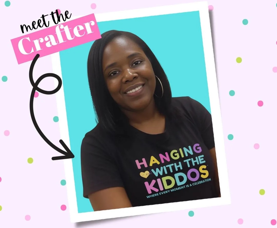
Latoya
Latoya is the founder of Hanging with the Kiddos, where she helps DIY creators design and print professional-quality party favors at home. Through step-by-step tutorials, editable Canva templates, and the Party & Confetti line of premium printing supplies, she shares practical tips that make creating personalized celebrations easier and more enjoyable. Her mission is simple: help families, creators, and small business owners Celebrate • Create • Grow.
Disclaimer
“This post may contain affiliate links, which means if you choose to make a purchase, I may earn a small commission from purchases made at no extra cost to you. Your support is invaluable in helping me continue providing free content on this site & I really appreciate It!”


